


Editor’s Note: I’ve had a number of readers ask me if paid-tier Smart Bonds readers are eligible for a discounted subscription to sister publication, The Free Market Speculator.
As a “Thank You” gift for subscribing, I’ve decided to offer all paid readers to Smart Bonds a 90-day free trial to The Free Market Speculator. That free trial is available using a special link — I’ll post the link to this offer below the “Actions to Take” section of this issue. And, yes, it’s open to all paid-tier readers, even those still within their trial period for Smart Bonds
And while our special offer for a 90-day free trial to Smart Bonds has ended, I’m still offering 30-day free trials to the paid tier for those interested via this link:
—EG
Real US Gross Domestic Product (GDP) fell -0.3% on a seasonally adjusted annualized rate in Q1 2025.
That’s the first quarter of negative GDP growth since Q1 2022 when the economy contracted at a 1% annualized pace.
Sounds ominous for the US economy and stock market, right?
Certainly, the negative GDP reading received a lot of attention in the mainstream and financial media, and I’ve received a few questions from readers about whether it means a recession is more likely.
Here’s the truth about GDP:
GDP data is always backward-looking and represents a terrible way to attempt to evaluate the health of the economy, or US equity and bond markets, on a real-time basis. And, fortunately, the negative GDP reading in Q1 2025 is pretty much meaningless.
Let’s start with this:
Source: US Bureau of Economic Analysis (BEA)
The BEA reports its first “advance” reading of US GDP growth one month after the end of the reference quarter. So, BEA released the Q1 2025 GDP estimate on April 30, 2025, one month after the quarter ended on March 31st and will release its first estimate for the current quarter (Q2 2025) at the end of July 2025. BEA then revises that advance estimate twice, starting one month after the initial release.
BEA also makes additional revisions to historic data over time.
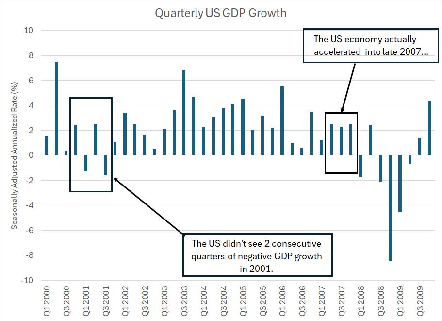
My chart above shows the final estimate for quarterly GDP in each quarter from Q1 2000 through Q4 2009.
The first point to address is that you’ll often hear a recession defined as two consecutive quarters of negative GDP growth.
That’s a terrible definition.
After all, as you can see in my chart above, there weren’t two consecutive quarters of negative GDP growth in 2001. So, by that definition there was no recession.
Yet, the US unemployment rate rose from under 4% in 2000 to as high as 6.3% in 2003, the stock market was shellacked between March 2000 and late 2002 and the Fed slashed rates from 6.5% in 2000 to 1% by 2003.
That level of damage to the real economy and financial markets certainly sounds like a recession to me.
In the 2007-09 Great Recession cycle, the US didn’t see a quarter of negative GDP growth until Q1 2008; as always the advance estimate of Q1 2008 GDP growth wasn’t released until late April 2008.
To make matters worse, Q2 2008 saw a rebound in US GDP growth followed by two more quarters of contraction in Q3 and Q4 2008. So, by the two consecutive quarters definition, the US didn’t enter recession until the end of 2008.
By that time, the Fed had already slashed rates to zero, the S&P 500 was down 50% from its late 2007 highs and the unemployment rate jumped over 7% from under 5% in the summer of 2007.
Simply put, two quarters of negative GDP growth will “miss” some recessions like 2001 entirely even though there are significant negative developments in the labor market and equities. And even when this signal “works,” it’s very late in telling us anything useful.
And, take a look at this:
Source: Bureau of Economic Analysis (BEA)
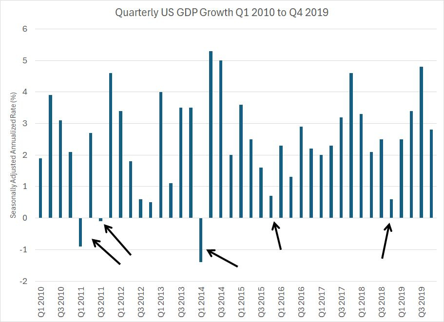
Here’s a chart of quarterly US economic growth on the same basis over the period from Q1 2010 to Q4 2019. There was no recession over this period, nor was there a bear market in the S&P 500; however, there were three quarters of negative GDP growth and several more notable slowdowns in growth over this time frame.
Again, that doesn’t tell you much.
And the Q1 2025 negative GDP number tells you even less than normal:
GDP = C + I + G +NX
This is an equation that defines US Gross Domestic Product (GDP) numbers reported by BEA.
This simple equation, or something like it, has probably been taught to first year economics students for close to a century now.
(At least that was the case when I did my undergraduate degree in economics in the 1990s, I have no idea what they’re teaching these days).
The “C” stands for consumption, which represents consumer spending on goods and services and it’s the most important component of economic activity in the US.
The “I” stands for investment, which is business spending on things like buildings and equipment. It also represents consumers buying homes.
“G” stands for government and for the US this is government spending at the federal (national), state and local levels.
That brings me to “NX,” which is defined as NET exports. This is the total level of US exports of both goods and services MINUS the total level of US imports in a given quarter. A surge in imports relative to exports will result in a negative “NX” number, which will deduct from the overall level of US GDP in that quarter.
Trade drove the negative GDP number in Q1 2025:
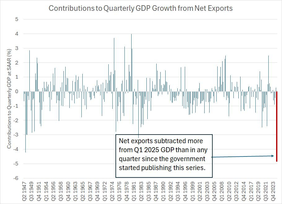
Source: BEA
The US started publishing quarterly data on US GDP in the second quarter of 1947 (Q2 1947).
This chart shows the contribution to quarterly GDP growth from the net exports (NX) part of the GDP equation for every quarter since Q2 1947 and I’ve highlighted the Q1 2025 number in red to ease visibility. In Q1 2025, net exports subtracted 4.83% from the quarterly GDP number reported at -0.3%, the largest negative contribution from “NX” in the history of this series.
And let’s add one more layer of granularity here.
As I said, “NX” is exports less imports. In Q1 2025, an increase in US exports actually added 0.19% to GDP; however, that was overwhelmed by an historic surge in imports, which subtracted 5.03% from GDP. Goods imports – NOT services – alone subtracted 4.79% from Q1 2025 GDP.
In other words, that negative GDP figure was entirely a function of rising US imports of physical goods in the quarter. And that surge was the result of companies trying to get ahead of US tariffs imposed by the Trump Administration starting in early April.
We can also see this effect in data released by US seaports.
The Port of Los Angeles, for example, releases data on container counts – in terms of Twenty-Foot Equivalent Unit (TEU) containers – handled at the port each month. They release the monthly totals around the 15th of the ensuing month, so we got the March data in mid-April and will get the April data in the second half of next week.
On an annual basis, the Port of Los Angeles handled about 10.30 million TEUs last year, the second highest on record following 2021 when it handled 10.68 million TEUs. However, against that very strong 2024 baseline, January 2025 TEUs were up +8.02%, February TEUs were +2.55% and March jumped +4.71% year-over-year.
As I said, we won’t get the exact data for April until next week. However, the executive director of the Port, Gene Seroka, indicated that real time tracking data shows a 35% year-over-year drop in imports through the first full week of May relative to the year ago period. Almost half the Port of LA’s volumes are from China and the port is characterizing the shorter-term trends in imports as a “precipitous drop.”
In other words, in Q1 2025 the US saw a surge of imports as companies sought to get ahead of tariffs, particularly goods tariffs levied on China. In effect, these companies pulled forward Q2 2025 imports into Q1 2025 and we’re now seeing a hangover as imports collapse.
Ironically, for US GDP, the Q1 2025 surge in imports artificially depressed Q1 2025 GDP while a commensurate collapse in Q2 2025 imports will artificially boost Q2 2025 GDP.
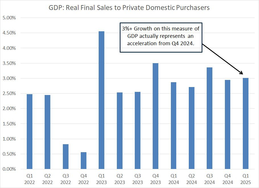
One way to adjust for this distortion is to watch the real final sales to private domestic purchasers, which represents the sum of consumer spending and gross private investment:
Source: Federal Reserve Bank of St. Louis
This measure of GDP is known to be a favorite of Federal Reserve Chairman Jerome Powell; it nets out the distortions caused by quarter-to-quarter swings in trade, government spending and inventory accumulation. The idea is to get a better read on growth, or lack thereof, for the private sector.
On this basis, the US economy grew faster in Q1 2025 than Q4 2024 and Q1 marked the second-highest quarterly growth reading since Q4 2023.
And that brings me to last week’s jobs number:
Payrolls are Backward-Looking
As long-time readers know I believe the monthly Bureau of Labor Statistics (BLS) payrolls data is flawed.
It’s widely watched by markets and the Fed, which is why it’s important. However, a tendency toward massive revisions that can change the economic message limits its utility in economic forecasting.
Heading into last week’s payrolls number, the consensus on Wall Street was for a gain of +133,000 jobs and for the unemployment rate to remain flat at 4.2%. However, BLS reported total non-farm payrolls up +177,000 in April, somewhat stronger than anticipated. The unemployment rate remained flat at 4.2%.
Dig a bit deeper inside the data and the news was more mixed. BLS revised payrolls for the two prior months – February and March – down by 58,000 jobs including -43,000 from March alone. Add the downward revisions to April payrolls and you get +119,000, which was actually slightly below Wall Street expectations.
Moreover, in April, +58,200 of the jobs created in the US – about 35% of all jobs created by the private sector -- were in health care including 22,000 jobs in hospitals and 21,000 in ambulatory health care services. There’s nothing wrong with that, of course, but as a rule the healthcare industry is less cyclical than most other sectors of the US economy. So, better-than-expected payrolls driven by gains in healthcare tells us little about the health of the economy.
We saw a pop in initial claims last week though this week’s data is more benign:
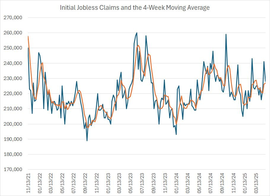
Source: Federal Reserve Bank of St. Louis
This chart shows weekly first-time filings for unemployment benefits (blue line) and the 4-week moving average of the same series (orange line).
As you can see, claims jumped to 241,000 last week, the second-highest reading so far in 2025 to the 243,000 reported in the week ended February 22nd. And, you can’t blame that jump on declining government payrolls and the Department of Government Efficiency (DOGE) – claims from Washington DC, Virginia and Maryland, the region most impacted by DOGE, were just 5,834 combined last week, the lowest since the week ended January 4th.
Of course, while the week ended April 26th – the latest data on initial claims – is in the month of April, the BLS payrolls data is based on surveys conducted around the middle of the month. So, any change in employment trends after mid-April will show up in the May data, due to be released on June 6th. And changes in the labor market after around the middle of this month, will show up in the June data, which will be released in early July.
And this week’s initial claims data, covering the week ended Saturday May 3rd, was benign. Claims fell to 228,000, which is above the 4-week moving average, yet better than the consensus expected at 430,000.
It's important to note that a one-week jump in claims isn’t conclusive.
Look at my chart above and you’ll see that we’ve witnessed several short-lived spikes in claims since late 2021, yet there’s been no recession and payrolls have continued to grow.
Even last week’s reading at 241,000 is low from a historical perspective.
What I’m watching for is a sustained move higher in claims, above the range since late 2021 that I’ve pictured in my chart above (that would be above 260,000 or so). Longer term, I’d be looking for a rise to 300,000 to 325,000 or higher, a level that would be consistent with elevated risk of recession.
We’re just not there yet.
And that brings me to this:
High-Yield Spreads
In the April 7th issue of Smart Bonds, “Soft Data Complacency,” I spilled considerable digital ink regarding the jump in high-yield credit spreads.
Over the roughly one month since I wrote that issue, spreads have eased:
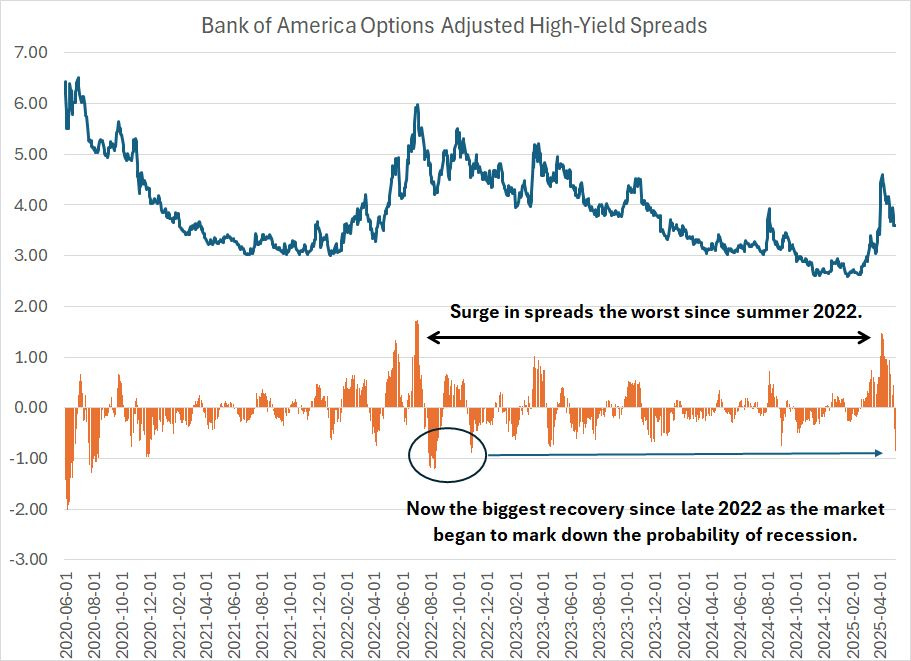
Source: Federal Reserve Bank of St. Louis
This chart shows the yield spread between the Bank of America High-Yield Bond Index and US Treasuries of equivalent duration as a dark blue line.
When this spread spikes, US companies with credit ratings below investment grade are paying up to borrow money. Since corporates with high-yield or “junk” credit ratings are considered more vulnerable to the economic cycle – they’re more likely to struggle to service their debt during recession – a spike in this spread is a classic harbinger of recession.
The orange columns below my chart show the 20-day change in high-yield spreads.
As you can see, about a month ago high yield spreads spiked to almost 150 basis points (1.50%), the highest since the summer of 2022, the height of the recession scare that year.
In absolute terms, spreads remained well-behaved – the peak spread of 4.61% is far below the typical 6%+ level we see during recessions. However, the speed of the rise – 1.5% over just 20 trading days – was indicative of rising economic risks.
The good news is that since mid-April, spreads have collapsed to 3.51%, falling close to 1% over just the past 20 trading days.
That’s the fastest drop in credit spreads since the fall of 2022, as the S&P 500 bottomed and markets began to mark down the probability of a recession that year. You could say that the late summer and autumn of 2022 was a time when markets began to sniff out a potential soft landing despite the Fed’s tightening campaign.
The April 7th issue, “Soft Data Complacency,” penned at the height of the tariff panic in financial markets, centered on three, related points:
First, we’d seen a notable weakening in the soft economic data – survey-based data such as the Institute for Supply Management’s (ISM) Purchasing Managers’ Index (PMI) -- but weakness in the soft economic data had yet to show up in the hard data like the monthly payrolls report from BLS.
This point remains just as valid and important today as it was a month ago in early April.
Last week we saw softness is the ISM Manufacturing PMI data, a “soft” economic data series I follow closely. Specifically, while the April reading was a bit stronger than the consensus on Wall Street feared, it was still down from March and below 50.0 for the second consecutive month, indicating contraction.
Further, the new orders to inventories ratio – one I’ve mentioned in these updates on several occasions – registered at 0.93, which is well below the level of 1.0 that I consider healthy.
Yet, while PMI was weak, not unlike last month, the April payrolls data was OK, at least superficially, as I outlined. And a one-week pop in claims, though something to watch, is at best a nascent sign of weakness, not conclusive evidence of weakness in the “hard” economic data.
The hard data isn’t weakening yet.
The Fed historically follows the hard data more closely than the soft data. Since most hard economic data is lagging that’s why the central bank is often late – they cut rates too late to avert recession and then are forced to panic, easing policy aggressively in an effort to make up for lost time.
So, right now, the market is marking down expectations for the Fed to cut rates in the first half of 2025. A month ago in early April, the Fed Funds market saw the probability of a rate cut of 25 basis points or more at the central bank’s May 7th meeting (today) at 33% and one or more cuts by June 18th at a whopping 94.5%. This week, the Fed stood pat on rates and the market sees only a less than 18% chance the Fed cuts at the June 18th meeting.
Market interest has pivoted to the second half of this year – a month ago, Fed Funds futures priced in 68.4% probability the Fed cuts 4 or more times (100+ basis points) by their final meeting this year (December 10, 2025). Today, the market is pricing in a less than 1-in-4 probability of such an outcome and 60% chance the Fed cuts 3 or more times.
In short, for now the market, and the Fed, are taking the glass-half-full view of the health of the economy.
My view is that’s complacent and would change quickly should we see some evidence the hard economic data is deteriorating.
Recall, in 2022 we saw much the same pattern of weakening soft data and resilient hard data we’re seeing today and there was no recession. Given fresh memories of that pattern, investors, and the Federal Reserve, are likely too quick to discount the possibility of recession this time around – in most cycles, the soft data weakens first, followed by the hard data a few months later.
So, I believe the 50/50 12-month recession probability I outlined in the early April issue remains about right. It will be crucial to remain vigilant – I’ll be watching the high-frequency hard data series like the weekly initial jobless claims closely for signs of weakness. That would be a signal the probabilities are tipping in favor of an economic contraction.
Third, in early April, I called for a snap-back rally in the broader market and some of the more vulnerable and economically sensitive niches of the bond, credit and preferred markets we track in Smart Bonds.
That call has proved correct with the S&P 500 rallying as much as 18% off its intraday lows set on April 7th.
A month ago, I highlighted 3 segments of the model portfolio that are most vulnerable to selling pressure amid recession or a bear market in the S&P 500 – high yield bonds, senior bank loans and preferreds. These are also the market segments that benefit the most from sustained economic growth and a higher-for-longer interest rate scenario. Because of my expectations for a snap-back rally in the broader stock market, I did NOT recommend reducing our (modest) model portfolio exposure to these three areas.
That proved a good call. Since the close on April 7th, our top-weighted high yield ETF recommendation has rallied about 4%, our preferred stock recommendations are up an average of 3.2% and our senior loan ETF has jumped 3.8% compared to a 1.1% fall in the benchmark Bloomberg Aggregate US Bond Index.
And that brings us to the current situation.
From a strategic perspective, the most important decision will be something I’ve been writing about since last summer in “The Great Duration Tipping Point.”
Simply put, during recessions longer duration Treasuries (government bonds that benefit most from falling rates) tend to outperform. So, if the hard economic data does begin to show signs of weakness, I’ll be looking to reduce our exposure to more cyclical, economy-sensitive niches of the markets we cover in Smart Bonds, in favor of long duration Treasuries or government bonds issued by other developed countries.
However, being early to the duration trade can be painful indeed – should the economy reaccelerate, long-duration Treasuries can get hit as the market prices in a tighter Fed, and economy-sensitive groups like senior loans outperform dramatically.
From a portfolio management perspective, I’m a believer in making incremental and gradual adjustments to the portfolio over time rather than reacting to every twist and turn in popular investment and economic narratives out there. It remains too early to pivot aggressively in favor of the recession trade in the model portfolio.
In the model portfolios, I recommended adding a small allocation to unhedged long duration Treasuries on March 4th. However, I’ve preferred the belly of the curve via intermediate-term Treasury and investment grade corporate ETFs, which have returned 3.6% and 2.5% respectively year-to-date in 2025. That compares to about a 2.4% gain in the benchmark Bloomberg US Aggregate Bond Index and about a 4% decline in the S&P 500.
Intermediate-term bonds have historically performed well in the lead-up and early stages of US recessions. However, this segment of the bond market can also perform well in a soft-landing scenario where the Fed holds rates roughly constant over time such as was the case in the late 1990s.
I also continue to favor special situations within the bond, credit and preferred markets this year.
One of my favorite opportunities right now is the global bond market, specifically bonds issued in currencies other than the US dollar. Not only have these markets been outperforming US fixed income this year, but investors get an added “kicker” from the weakness in the US dollar I’ve been writing about in Smart Bonds since January:
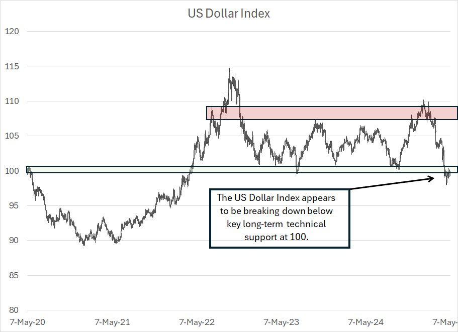
This is a five-year chart of the US dollar Index and I’ve labeled an obvious technical support level around 100 and a resistance zone around 110.
As you can see, the dollar broke higher, above that resistance level in mid-January, but the move quickly failed, and the dollar collapsed to the lower bound of this trading range. Now, the Dollar Index is breaking below this support level and I’m looking for additional downside ahead.
Indeed, as I’ll cover in just a moment, I believe we’re seeing a shift in what I call the “Great Cycle.” Simply put, these are multi-year cycles of shifting performance in various asset classes.
Much like 2000 and 1968, I believe the 2024-25 period represents a peak in the phase of this cycle that favors US equities and a strong dollar above most other asset classes. As the cycle turns, we typically enter a period of US stock market underperformance and a weaker dollar, the latter trend will support additional upside in global non-dollar bond markets.
Regardless, our global bond market ETFs have been the best performing allocations in the model portfolio since recommendation. The two global bond ETFs we added on March 4th are up 8.2% and 6.5% respectively compared to a slight decline in the benchmark Bloomberg Aggregate US Bond Index.
In this update, I’m making some additional changes to the model portfolio, adding to our global exposure and adjusting our allocation to stocks in our Dynamic 60/40 model portfolio in response to the recent rally in the S&P 500.
Here’s a rundown of the changes and additions I’m making:
Keep reading with a 7-day free trial
Subscribe to Smart Bonds to keep reading this post and get 7 days of free access to the full post archives.