

Editor’s Note: This issue represents my detailed quarterly update for Smart Bonds, and I’m including a handful of model portfolio adjustments under the “Actions to Take” section of this (lengthy) issue.
For free-tier readers who would like to see all the specific bond, credit and preferred stock ETFs in the 3 model portfolios, and the changes I’m making this week, I am offering 60-day free trials to the paid tier of Smart Bonds for a limited time by tapping this button:
— EG
Last Friday’s weak August payrolls report from the Bureau of Labor Statistics (BLS) confirmed a key shift in market psychology.
The question was no longer if the Fed will cut rates at its meeting next week, rather whether the central bank will cut by only 25 basis points or opt for a super-sized 50 basis point cut as it did one year ago. Even more important, the debate has moved to how quickly the Fed will bring down rates into early 2026.
This week’s record downward revision to prior payrolls estimates, released as part of the BLS’ preliminary benchmark revision on Tuesday September 9th, is even more important and has further fueled the shift in Fed cut expectations and Treasury yields.
Currently, Fed Funds futures peg the probability of a 25-basis point cut this month at about 93% and a full half point cut at 7%.
As I’ll explain in just a moment, my view has been, and remains, the Fed will cut at each of its three remaining meetings in 2025 -- a total of 75 basis points – taking the Fed Funds target rate to 3.50% to 3.75% by the central bank’s December 10, 2025 meeting.
At the end of July, Fed Funds futures saw the probability of three or more cuts through year end at a little under 20.5% compared to a 35% probability the Fed would either cut 25 basis points or hold rates steady through yearend. As of yesterday’s close, the probability had jumped to more than 80% the Fed will cut 75 basis points or more through yearend.
Recall that at Fed Chairman Jerome Powell’s press conference following the July meeting, the key takeaway was that FOMC members saw risks to both sides of the Fed’s dual mandate – risks of an upward surge in inflation driven, at least in part, by tariffs and some downside risks to the labor market.
In July, the majority concluded the central bank could afford to wait on additional cuts until they saw evidence of a shift in risks – either a deterioration in labor market conditions or signs tariff-driven inflation impacts were likely to mean more than a one-off boost to prices.
The two Fed Governors who dissented in July, favoring a 25-basis point cut, saw greater risks to labor market conditions. Christopher Waller, one of the dissenters who also happens to be a leading candidate to replace Powell as Chair next year, explicitly noted the risk of likely downside revisions to BLS payrolls data over time in a statement released after the meeting.
That was two days prior to the disastrous BLS July payrolls report showing a whopping 258,000 in combined downward payrolls revisions for May and June data. Simply put, the August 1st payrolls release played right into the doves’ key argument that the majority at the Fed had underplayed risks to the labor market.
On August 22nd at the Jackson Hole Symposium, Powell clearly signaled a shift in his view more in line with the July doves – he highlighted rising risks to the labor market and indicated that when the labor market deteriorates it can do so quickly in the form of “sharply rising layoffs and rising unemployment. “
Last Friday’s August jobs report further cemented this shift:
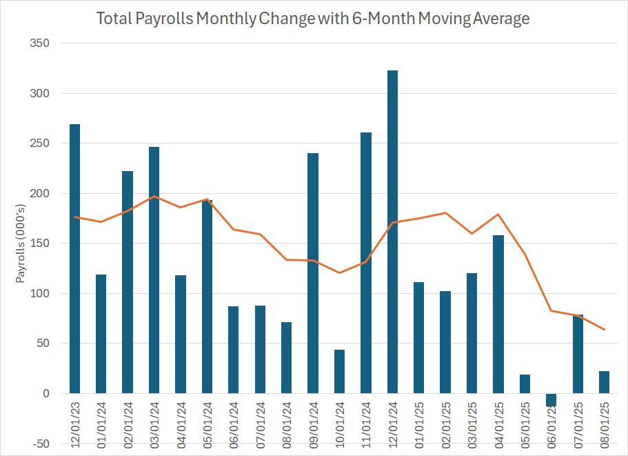
Source: Federal Reserve Bank of St. Louis
The columns on this chart show the monthly change in total nonfarm payrolls since December 2023 while the orange line shows the 6-month moving average.
BLS reported last week that the US added only 22,000 payrolls in the month of August 2025, well below the consensus outlook on Wall Street for about 75,000 jobs. In addition, BLS lowered its June payrolls estimate by 27,000, from the previously reported +14,000 to a jobs loss of 13,000. That was only partly offset by a 6,000 upward revision to July jobs from +73,000 to +79,000.
Keep in mind the initial BLS estimate for June payrolls released in early July was +147,000.
Based on the numbers released Friday, and the revisions to June and July, there has been a clear deceleration in the labor market since the spring with the 6-month moving average of payrolls falling from 179,000 in April to about 64,000 in August.
The unemployment rate held steady in August at 4.3% on a rounded basis, however, look at the unrounded data:
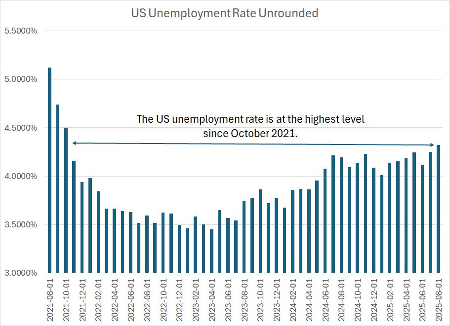
Source: Federal Reserve Bank of St. Louis
The payrolls data in the monthly BLS release is derived from the Establishment survey while the unemployment rate is derived from the Household Survey; the latter survey has an even larger margin of confidence than the former. So, theoretically, we shouldn’t be making much of 0.1% to 0.2% changes in the official unemployment rate, which could very well represent statistically insignificant noise.
However, the Federal Reserve, and to be fair many on Wall Street, insist on giving the monthly Employment Situation report a great deal of weight in their analysis and decision-making process. Put simply, it moves markets, so we must keep tabs even on deeply flawed, lagging numbers like the unemployment rate.
In this case, on an unrounded basis, the US unemployment rate rose to 4.3237% in August, up about 0.08% from July, and rising to the highest level since October 2021 when labor market statistics were still distorted by COVID-era lockdowns and travel restrictions.
While 4.3% is still a low unemployment rate in absolute terms, the recent rise backs up the message we’re seeing in the headline payrolls deceleration I just outlined.
With the Fed firmly focused on downside risks to the labor market, I’d argue incoming inflation data over the next few months is less likely to sway the Fed from cutting rates. I suspect any acceleration in inflation will simply be explained away as a one-off boost related to trade policy with little impact on longer-term inflation expectations.
And that brings me to this week’s news on the jobs front:
Preliminary Benchmark Revisions
BLS bases its monthly Employment Situation reports on two surveys, namely the Establishment and Household surveys of businesses and individuals respectively.
However, with a significant lag, BLS also collects far more complete and accurate data from the states reporting unemployment insurance tax data – this data is known as the Quarterly Census of Employment and Wages (QCEW) and, unlike the monthly Employment Situation Reports, it’s not based on survey data.
Each year, usually in late August or early September, BLS releases a preliminary revision to payrolls data followed by a final revision in early February timed with the release of the normal monthly January jobs release.
This year, BLS reported its annual preliminary benchmark revision on Tuesday September 9th, and it was historic – BLS revised down its prior estimates of total non-farm payrolls by a record 911,000 including an 880,000 downward revision to private sector payrolls.
The preliminary benchmark revision released this week relates to BLS estimates for the change in total payrolls over the 1-year period from March 31, 2024 through March 31, 2025.
In brief, let’s run through the BLS process over the course of a year.
As I said, each month, BLS takes two surveys to create its monthly payrolls estimates. The Establishment Survey, a survey of about 650,000 worksites around the US, is the source of the monthly payrolls statistics and BLS indicates the confidence interval around these estimates is +/- 136,000.
In other words, BLS reported last week that the US added 22,000 jobs in the month of August 2025. What that really means is that BLS believes with 90% confidence that the actual number of jobs created (or lost) last month was between -114,000 and +158,000.
Of course, financial markets tend to react to the actual BLS estimate, ignoring the wide confidence interval. Had the August jobs release come in at +158,000, when it was released last week, almost double what the consensus expected, then I suspect the market reaction would have been very different than the actual estimate of +22,000 let alone a report showing a loss of 114,000 jobs.
To make matters worse, survey response rates for the Establishment Survey have been declining in recent years. Back in March 2015, for example, the response rate for the Establishment Survey was about 61%, declining to just 42.6% in March this year, the last month for which we have data.
Of course, a declining response rate forces BLS to use various adjustment and imputation techniques to fill in this missing data and produce their monthly employment estimates. Declining response rates and this imputation process have clearly resulted in a loss of data quality when it comes to the first BLS estimate of monthly changes in payrolls.
Over time, additional survey responses roll in and BLS uses the additional data to revise its initial monthly estimates. That’s what drove that massive downward revision of 258,000 payrolls to the May and June data released on August 1st. And by the time of the second BLS revision to the initial data (the third estimate of each month’s payrolls data) the Establishment Survey response rates climb to around 90% or higher.
However, that doesn’t mean all is well with BLS data.
There are two glaring issues. First, the Fed and most economic forecasters don’t ignore the monthly payrolls data until 3 months have passed and additional survey responses roll in.
For example, BLS reported last week that the US only created 22,000 jobs in the month of August 2025. This estimate could be way off and could be revised significantly higher or lower by the time BLS releases its second revision for the August data on Friday, November 7, 2025. However, that’s way too much of a lag to be useful for a central bank that’s trying to gauge subtle shifts in the health of the economy in near real-time.
Second, even AFTER additional survey responses come in with a significant lag the BLS data is still way off the mark.
Take a look:
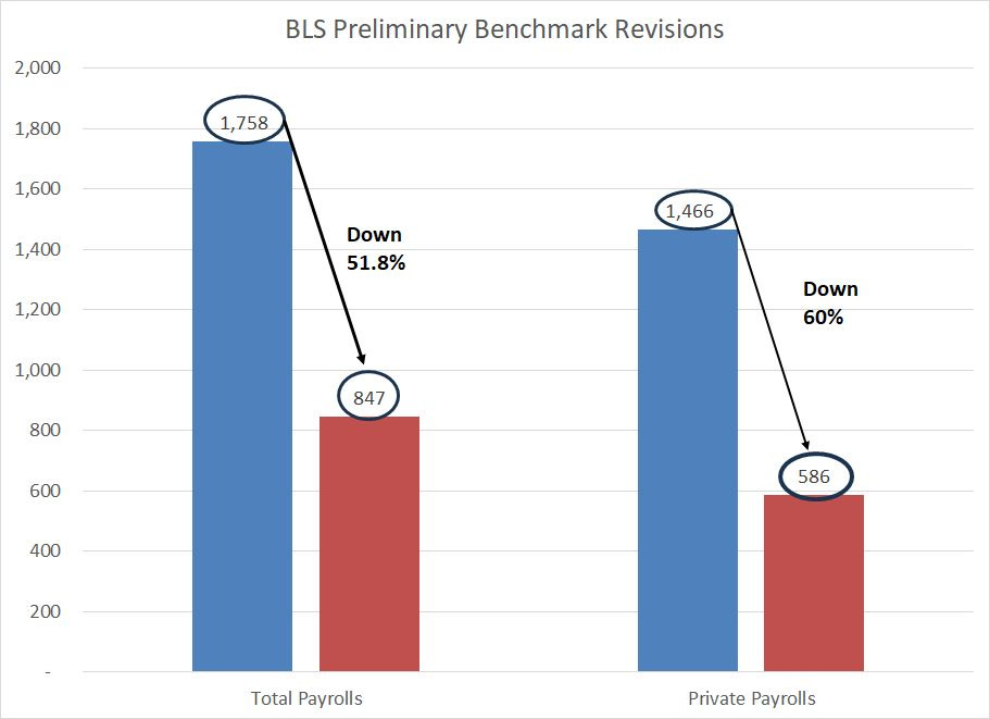
Source: Bureau of Labor Statistics
As I said, the BLS benchmark revisions aren’t based on the Establishment Survey data but on the far more accurate and complete QCEW dataset.
Based on the final revisions to monthly payrolls data derived from the Establishment Survey, BLS estimated the US created 1.758 million total new jobs over the 12 months from April 2024 through March 2025 inclusive, and 1.466 million private sector jobs.
With this week’s preliminary benchmark revision, however, BLS revised total payrolls gains for this same period lower by almost 52% to just 846,000. For private payrolls the revision was even larger in percentage terms at 60% to just 586,000.
Put in a different way, up until this Tuesday, BLS estimated that the US added about 146,500 new jobs per month over the period from April 2024 through March 2025 including over 122,000 in the price sector.
That’s a healthy labor market.
Now, BLS tells us the US only added a little over 70,500 payrolls per month over this period and less than 50,000 private sector jobs.
That suggests an economy far closer to stall speed and points to the need to cut rates to forestall additional deterioration in the labor market.
Some economists will tell you that’s not a huge miss. After all, BLS tells us the total US civilian labor force is just shy of 171 million and there are just under 160 million nonfarm payrolls. So, a downward revision of 911,000 payroll represents less than 0.6% of total payrolls.
However, that’s irrelevant.
The problem is that the Federal Reserve, private sector economists on Wall Street, and investors all have to make decisions based on the information and data they’re presented. The sheer scale of downward revisions to Establishment Survey data in subsequent months, and between survey-based data and the benchmark revisions using QCEW, calls into question the accuracy of BLS data.
As I’ve written before, a good rule of thumb to keep in mind is that revisions are serially correlated.
In other words, when BLS revises downward its initial estimates of monthly payrolls that tends to mean subsequent revisions will also be to the downside and, even more important, that the ultimate benchmark revisions will be to the downside.
In my view, this strongly suggests that some of the imputation techniques BLS uses to create its monthly payrolls estimates based on the Establishment Survey are biased in favor of showing an artificially strong labor market.
Many economists have pointed to what’s known as the birth-death adjustment – a technique for estimating the number of new business “births” and “deaths” (business closures) over time – as a likely culprit for these discrepancies. That’s certainly plausible.
But, in practical terms, it’s also irrelevant.
That’s because given the trend to downward labor revisions lately, the Fed is likely to remain firmly focused on its labor mandate rather than trends in inflation. That also means the central bank is likely to take any stronger or better-than-expected monthly payrolls data with a proverbial grain of salt.
Rates are coming down.
You can also clearly see the shifting outlook in the Treasury market as well:
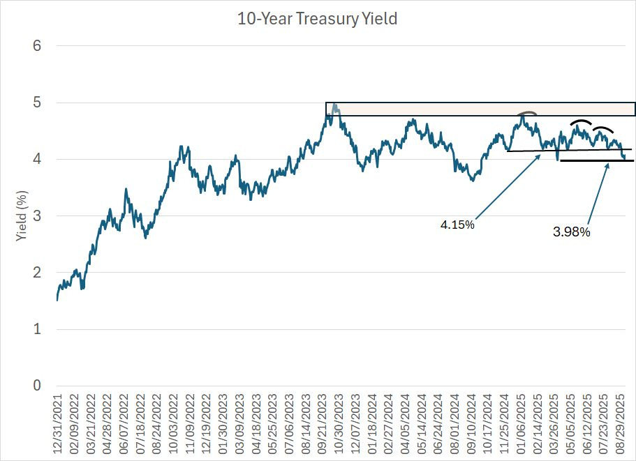
Source: Yahoo Finance Retrieved Using Python Script
This chart shows the yield on the 10-Year US Treasury since the end of 2021.
As you can see, the peak in yields over this period was around 5% in late 2023. Since the rise to that absolute peak at 5% was a short-lived spike in October 2023, I look at the technical resistance region on this chart at 4.80% to 5.00%, a level I’ve drawn in here as a red-shaded range.
That resistance zone was subsequently retested in the spring of 2024 and January of this year; however, 10-year yields did not break higher, and the resistance zone held. Since January, there have been plenty of potentially bearish news headlines for Treasuries (bearish prices means higher yields) including concerns about the US debt position and a handful of tough Treasury auctions that “tailed,” essentially meaning that the Federal government was forced to pay up to borrow money.
However, Treasury sell-offs in May and July of this year ended with yields well below the January 2025 peak and the 4.80% to 5.00% resistance zone I outlined on my chart.
Now, Treasury yields are hovering around 4.07%, below a shelf of technical resistance at 4.15% dating from late last year and just above 3.98%, a level which represents the April 4th tariff-panic lows for Treasury yields this year.
The path of least resistance here is clear – lower for yields and higher for prices.
Granted, the 30-year Treasury doesn’t look (quite) as bullish:
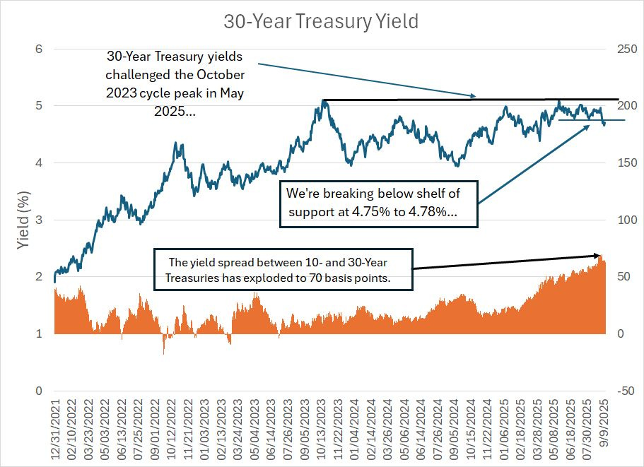
Source: Yahoo Finance Retrieved using Python Script
The dark blue line is the yield on 30-Year Treasuries since the end of 2021. As you can see, unlike the 10-Year, the yield on 30-Year Treasuries did test the autumn 2023 peak at roughly 5.10% in May of this year though resistance for yields (support for prices) held and yields have now slumped to near 4.70%. That represents a break below a key level as there’s a shelf of support for yields (resistance for prices) in the 4.75% to 4.78% region which I’ve drawn on my chart.
What’s interesting here is that the difference in yield between 10- and 30-year Treasuries recently exploded to +70 basis points (30-year yields 0.70% more than the 10-year), which is a sizable premium relative to anything we’ve seen in the period covered by my chart.
This clearly reflects lower demand for the 30-year bond relative to the 10-year, or bonds of shorter duration. Given the uncertain outlook for inflation and the federal government’s fiscal position, it makes sense that investors would be loathe to lock up their money for 30-years at a rate of less than 5%. After all, for a long period of time in 2023 and 2024 investors could earn 5%+ yields buying Treasury Bills or parking their cash in a money market account.
If the Fed does cut rates 75 basis points more through the end of 2025, then T-Bill yields will be in the 3.50% to 3.75% region, and I suspect those higher yields on the 10 and 30-year will start to look more attractive. That’s particularly true if current expectations for the Fed Funds rate to continue falling to under 3% by the end of 2026 hold up.
I’d also note that while these yield spreads are elevated relative to history since 2021, that’s not the case over longer holding periods:
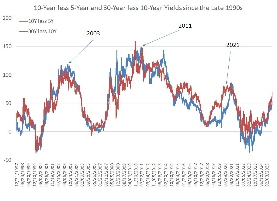
Source: Yahoo Finance Retrieved Using Python Script
This chart shows two yield spreads since the late 1990s – the 10-year Treasury yield less the 5-Year yield in blue and the 30-Year Yield less the 10-Year in red.
(Note that the Treasury ceased issuance of 30-year bonds for a period between 2002 and 2006, so the yield on 30-year bonds was imputed over this period).
Regardless, current yield spreads are right in the middle of the long-term range.
In my view, the biggest risk to equities out there is NOT that the Fed doesn’t cut, or yields on 10-Year, and 30-Year Treasuries rise – it’s the exact opposite.
Specifically, a scenario where the Fed cuts and bond yields fall because markets grow increasingly concerned about economic growth and the economy. Historically, the worst bear markets for stocks – including 2007-09 and 2000-02 – happen when the Fed is cutting rates and yields are falling.
To be clear, a recession scenario would be bullish bonds and bearish stocks.
I still see the recession scenario as unlikely.
Recession Unlikely
Last week we did see a significant move higher in initial jobless claims to 263,000:

Source: Federal Reserve Bank of St. Louis
Initial jobless claims – first-time filing for unemployment insurance – are reported by the individual states on a weekly basis and, unlike the monthly BLS numbers, they’re not based on survey data.
Last week’s reading of 263,000 was well above the 235,000 expected, and it’s at the top of the range since 2021.
However, historically, a real deterioration in labor market conditions would be associated with a more significant jump in claims – to around 280,000 to 300,000 per week or more would get my attention. At 263,000 in the most recent week, we’re a long way from that red line.
Moreover, as you can see in my chart above, the week-to-week claims data (blue line) is noisy and prone to short-term spikes, so I tend to focus more on the four-week moving average, which currently sits at 240,000, below the levels we saw back in mid-June.
So, initial jobless claims remain a factor I’m watching closely, but we’re not yet to a level that’s a significant concern.
And credit spreads remain on my radar:
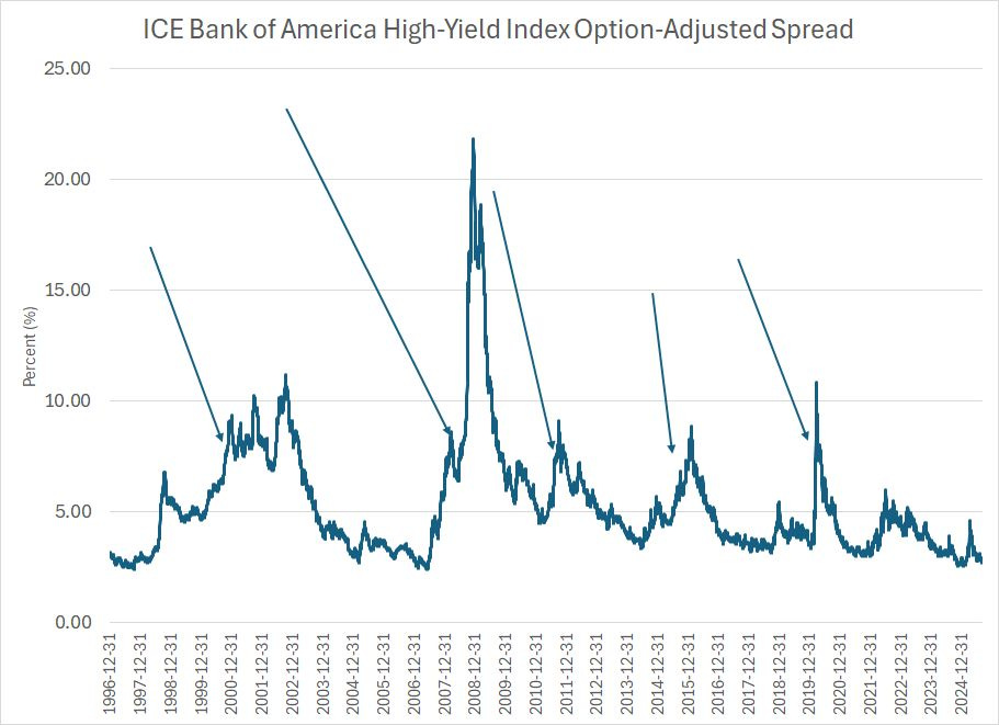
Source: Federal Reserve Bank of St. Louis
This chart shows the yield on the ICE Bank of America High-Yield Bond Index relative to Treasuries of equivalent duration. High-yield or “junk” bonds are corporate bonds issued by companies with lower credit ratings – historically, during recessions or “growth scares” investors grow worried about the credit quality of these shakier companies and demand a large yield premium to buy high-yield bonds. This spread then spikes or “blows out.”
This chart shows data back to the mid-1990s and I’ve used arrows to label multiple spikes over this time period. The 1999-2000, 2007-08 and 2020 spikes all preceded recessions for the US and bear markets in the S&P 500. Meanwhile, when the spread blew out in 2015-16 and 2011-12 these episodes corresponded to serious growth scares where investors grew worried about rising recession risks and stocks experienced nasty pullbacks and volatility.
The spike in spreads amid the April tariff panic was mild by historic standards and today, spreads continue to hover near multi-year lows around 2.78%.
That suggests little or no concern in the bond market about the health of the economy.
And, don’t forget one of the best leading indicators around, namely stocks. The S&P 500, the Equal Weight S&P 500 and the MSCI World ex-US Indices are all trading near the highest levels of the entire cycle while almost 70% of NYSE-traded stocks are in uptrends above their respective 200-day moving average.
That’s just not bearish.
However, given my outlook for Fed policy and longer-term Treasury yields, it’s time to make some adjustments to the model portfolios in Smart Bonds starting with this:
Selling Floating Rate Exposure
The Vaneck Investment Grade Floating Rate ETF (NYSE: FLTR) was one of the inaugural recommendations in the Smart Bonds model portfolios.
Overall, FLTR has performed well, rising 7.43% since the close on May 30, 2024:

Source: Yahoo Finance Retrieved Using Python Script
While that’s below the return on the Bloomberg US Aggregate Bond Index – a benchmark we’re measuring using the iShares Core US Aggregate Bond ETF (AGG) on this chart -- of roughly 10.1% over a similar period, FLTR has less price volatility than that benchmark. You can clearly see FLTR’s low volatility in the chart above – note the steady rise in FLTR total returns over this period compared to the more jagged volatility in the broader US bond market.
For those who prefer to quantify risk, the annualized historic volatility for FLTR since the end of May 2024 is about 3.3% compared to roughly 5.5% for the US Aggregate Bond Index.
FLTR also offers a yield near 5.2% paid in the form of monthly distributions compared to a little under 4% for the iShares Core US Aggregate Bond ETF.
FLTR is designed to track floating rate bonds issued by investment grade corporations in US dollars.
Not all bonds in the portfolio are issued by US companies – indeed, as of the most recent report, the US accounts for a little under half the portfolio with the UK, Australia and Canada combined representing about one-third of the ETF’s holdings. However, FLTR only buys bonds issued in US dollars regardless of whether the issuer is a US or foreign corporation.
Almost 85% of the bonds in the portfolio are issued by financial companies – mainly large banks – which have historically dominated the market for investment grade dollar-denominated floating rate bonds.
The most important feature of the bonds FLTR buys is that they all pay interest that periodically resets based on some specific US interest rate benchmark, normally the Secured Overnight Financing Rate (SOFR), a short-term interest rate benchmark that’s the primary replacement for the London Interbank Offered Rate (LIBOR).
The easiest way to illustrate is with an example.
One of the largest holdings in the FLTR portfolio right now is a Floating Rate Senior Note issued by Morgan Stanley (NYSE: MS) in April 2024 that matures on April 13, 2028.
This floating rate note pays interest quarterly in January, April, July and October with the interest paid calculated as the SOFR rate plus a margin of 1.020%.
As I noted earlier, SOFR is a short-term rate, so it tracks the Fed Funds target range closely:

Source: Federal Reserve Bank of St. Louis
This chart shows SOFR as a blue line and the Fed’s upper and lower target bounds for the Fed Funds rate as green and red lines respectively. The purple line I’ve plotted represents SOFR plus 1.02%, which represents the rate carried by the Morgan Stanley floaters I just described.
A rising rate environment, such as we saw back in 2022-23 when the Fed is hiking rates, is bad news for most bonds with long-duration bonds getting hit hardest. However, floating rate bonds are not “fixed income” securities since the yield on these bonds rises as the yield on benchmarks like SOFR rise, compensating holders with a higher interest rate.
Thus, the duration of FLTR is just 0.12 years right now compared to 5.84 years for iShares US Aggregate Bond ETF (AGG) and around 16 years for the widely held iShares 20+ Year Treasury Bond ETF (NYSE: TLT).
For new readers or those unfamiliar with the concept of duration, I’ve written about this concept extensively in recent issues of Smart Bonds including “Rate Sensitivity and Credit Risk” back on July 24th, “Warning: Never Rush the Duration Trade” on June 9th and in the July 29, 2024 issue “The Great Duration Tipping Point.”
FLTR’s short duration is the main reason why it was one of only a handful of bond, credit and preferred ETFs to generate a positive return in 2022, the worst year for the US bond market in at least a half century. Of course, it was also a terrible year for stocks and the S&P 500.
Take a look:
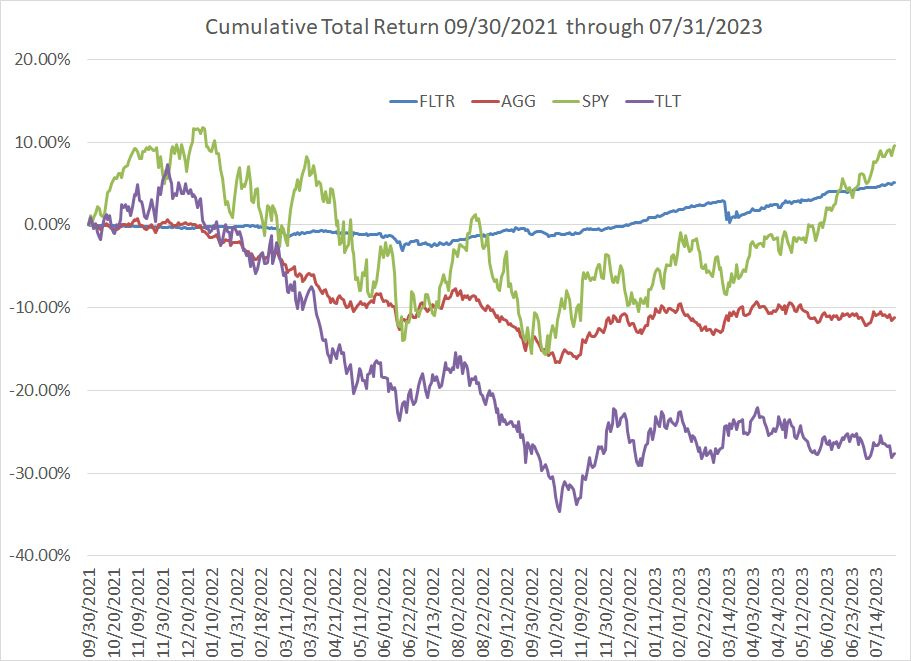
Source: Yahoo Finance Retrieved Using Python Script
This chart shows the cumulative total return for FLTR, AGG, the SPDR S&P 500 ETF (SPY) and TLT from the end of September 2021 through July 2023. End-September 2021 was just before the peak of the bull market in the S&P 500 in January 2022 and the start of the Fed’s most aggressive tightening campaign in decades in the spring of 2022.
July 2023 is the month of the Fed’s final interest rate hike of the 2022-23 tightening cycle.
In calendar year 2022, FLTR was up +0.74% while the Bloomberg Aggregate US Bond Index was off a little over 13% and the S&P 500 was down about 18.2%. The long-duration TLT declined more than 31% in that year.
As you can see, while the S&P 500 bottomed in the autumn of 2022, stocks didn’t “catch up” to FLTR on this basis until June 2023.
An investor who purchased FLTR on the last trading day of 2021, just before the worst bond bear market in a half century, managed to generate a total return of 8.1% over the ensuing two years compared to just 3.24% from the S&P 500 over a similar holding period and a loss of 8.1% in the Bloomberg US Aggregate Bond Index.
My point is that FLTR is a great place to “hide” and generate income when the Fed is hiking interest rates and most bonds are getting crushed.
And in late May 2024 when I created the Smart Bonds model portfolio, I still believed that it made sense to hold some investment grade floating rate exposure in the model portfolio. After all, while I suspected that rates were near a peak, I also didn’t see the Fed embarking on a major cutting cycle.
In such an environment, even after a handful of rate cuts, FLTR offered attractive income and some protection against renewed concerns about inflation or the need for “higher for longer” interest rates.
The Fed cut rates by 100 basis points (a full 1%) in the final 3 months of 2024 and I’m looking for the central bank to push through an additional 3 cuts (75 basis points) in its final 3 meetings this year.
That would put SOFR in the 3.50% to 3.75% range by the end of this year with further cuts likely into 2026.
That’s likely to make FLTR’s floating rate exposure far less attractive as rates on the bonds in the ETF’s portfolio reset lower.
Indeed, I suspect that as rates come down, driving down yields on ETFs like FLTR as well as Treasury Bill ETFs like our favorite, the iShares 0-3 Month Treasury Bond ETF (NSDQ: SGOV), investors will begin to look for corners of the bond, credit and fixed income markets that offer higher yields and/or capital appreciation potential.
So, in this issue I’m bidding adieu to FLTR, selling it from all three model portfolios in Smart Bonds for a solid gain since recommendation. I’m also redeploying the proceeds into a new ETF recommendation with a yield of around 6.9% right now as well as bolstering exposure to two other ETFs already recommended in the model portfolio.
The details of these changes are covered in the “Actions to Take” section below.
To paraphrase an old Wall Street saw, there are old investors and there are bold investors but there are no old, bold investors.
As I’ve explained in prior issues, my philosophy of portfolio management is to refrain from making dramatic, bold changes to the portfolio in a single move. Instead, I favor gradual adjustments over time.
That’s served the portfolio well over the past year.
After all, a year ago there was considerable chatter about a major Fed cutting cycle and pivot in favor of duration – buying long-term bonds to benefit from a significant drop in rates. As it turns out, the Fed’s decision to cut rates by 50 basis points on September 18, 2024 market almost the exact top for the bond market (low in yields).
Investors who pivoted aggressively to buy duration were crushed with the long duration iShares 20+ Year Treasury ETF (NYSE: TLT) tumbling 11.1% from the close on September 18th through yearend and the Bloomberg Aggregate US Bond Index down almost 3.4%.
So, I am not removing all our exposure to floating rate assets in the mode portfolio – in particular, I’m retaining exposure to an ETF that tracks variable rate preferred stocks as well as a senior loan fund. As I’ll explain in the “Actions to Take” section below, I believe both can continue to outperform FLTR as the Fed cuts rates this year as they have since the Fed’s first cut in September 2024.
Adjusting Global Bond Exposure
However, before I dive into the specifics of the portfolio adjustments I’m recommending this week, I’m recommending one more sale from the portfolio in the form of the Vanguard Total International Bond ETF (NSDQ: BNDX).
BNDX, like FLTR, was one of the recommendations in the inaugural issue of Smart Bonds in May 2024 and since that time it’s up about 7.5% including distributions paid.
BNDX tracks the Bloomberg Global Aggregate ex-USD Bond Index. This index is similar to the benchmark Bloomberg US Aggregate Bond Index except that, as the name suggests, BNDX tracks investment grades bonds issued by governments, government agencies and corporations outside the US, priced in currencies other than the US dollar.
The biggest holdings in BNDX are in Europe, which comprises almost 58% of the portfolio, followed by Asia at just under 20% and emerging markets around 7%. The duration on this ETF is just under 7 years, and it currently offers a yield of a little under 5%.
I remain sanguine on the global bond market.
Indeed, we’ve added significant exposure to global bond markets this year including introducing new global funds in the March 14, 2025 issue “The Economy, Credit Spreads and Global Rotation,” in the April 4th issue “Bonds, Inflation and Commodities,” and in the May 9th issue “Buying Abroad.”
Indeed, in this issue, one of my new ETF recommendations tracks a specific niche of the global bond market.
However, BNDX uses hedging strategies to reduce the fund’s exposure to foreign currency fluctuations against the US dollar. When I first added BNDX to the portfolio in May 2024, the US dollar index was still in an uptrend:
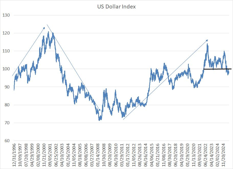
Source: Yahoo Finance Retrieved Using Python Script
This chart shows the US Dollar Index – the value of the dollar against a trade-weighted basket of foreign currencies – since the mid-1990s.
Historically, the dollar tends to move in multi-year trends; a few of these cycles are visible on my chart.
In the 1990s through early 2001, the dollar was locked in a powerful rally. There were several factors behind the dollar’s strength including strong economic performance, both in absolute terms and relative to other developed world peers through the 90s, as well as strong returns from US assets, particularly growth stocks, in the late 90’s boom years.
The dollar then entered a prolonged bear market, which persisted through the 2007-09 Great Recession years and, arguably until late 2011 when the dollar index retested its 2008 lows.
Since then, while it has been far from an unbroken uptrend, the dollar rallied to 20+ year highs in late 2022 and then came close to retesting that 2022 peak in January of this year.
The long bull market in the dollar from the 2008-12 lows through 2022 had its roots in similar catalysts to the 90s rally including that the US economy recovered faster from the Great Recession than many developed world peers like Europe and Japan. Also, of course, the S&P 500 and US-based technology stocks dominated global equity market returns for most of this period much as they did in the late 90’s.
As I’ve written a few times this year, I believe we may now be entering a new multi-year dollar bear market similar to what we saw from 2001 to 2011. As you can see, the sell-off from the January peak has the US Dollar Index trading back below a key technical support level at 100.
Additional rate cuts will make it less attractive from a yield perspective to hold dollars while the S&P 500’s dominance of global equity market returns has stumbled since late last year.
And while the dollar is down sharply this year, a glance at this longer-term chart of the Dollar Index reveals it’s still just above the midpoint of its 30-year range. A move back to the 2008-2011 lows is a plausible target over the next few years.
Simply put, when it comes to developed markets outside the US – by far the largest allocation in BNDX – I favor unhedged exposure to global currencies. The international funds we’ve added this year provide us with just that -- all have significant, unhedged non-dollar international exposure.
More broadly, keep in mind that, by definition, most of the exposure in the model portfolios is to US dollar-denominated assets. So, we’re not making some aggressive trade betting on further declines in the US dollar – rather, selling BNDX today is part of a gradual shift we’ve been making in the model portfolios this year to our global exposure.
Also note we still recommend significant exposure to US dollar-denominated bonds issued by emerging market governments and corporations and I’m adding a bit more to that allocation in this issue.
So, with those points in mind, let’s jump into the specific changes I’m recommending in this issue:
Keep reading with a 7-day free trial
Subscribe to Smart Bonds to keep reading this post and get 7 days of free access to the full post archives.