
Duration, Value and Relative Strength
Politics, the anchoring bias and pockets of value in bond ETFs

Last summer in “The Great Duration Tipping Point,” I wrote about the importance of duration when it comes to managing a portfolio of bonds, or fixed income exchange-traded funds (ETFs), such as we recommend in the Smart Bonds model portfolios.
Simply put, duration is a measure of a bond, or bond ETF’s, sensitivity to interest rates where the higher (longer) the bond’s duration, the more it stands to lose when rates rise, or gain when rates fall.
One of the more common benchmarks for the performance of the US bond market is the Bloomberg US Aggregate Bond Index, which includes a mix of government, investment-grade corporate and mortgage-backed securities (MBS). The iShares Core US Aggregate Bond ETF (AGG) isn’t a name we recommend in the model portfolio; however, it seeks to track this Bloomberg Bond Index, so it’s useful for monitoring the performance of the US bond market.
Currently, the effective duration of AGG is about 6 years. So, if you’re looking to outperform this benchmark, you’re likely to want to own ETFs with a duration longer than 6 years during periods of generally falling rates. When rates, and government bond yields are generally rising, you’d want the opposite – exposure to shorter-duration bonds that tend to perform better when rates rise.
Of course, there are more factors to consider, and more sources of risk, for a portfolio of bond ETFs than duration – more on that in just a moment -- however, that’s usually a good place to start.
The fixed income ETFs in the Smart Bonds model portfolios have an average duration of less than 4, so they have less rate sensitivity than the Bloomberg Aggregate Bond Index I just outlined. In fact, that’s been the case since the portfolios’ inception last May.
Of course, within the portfolio, we have some ETFs with higher duration than AGG and some tracking groups like fixed rate preferreds that tend to have significant sensitivity to rates even though most preferred ETFs don’t specifically calculate the duration of their portfolios. These are the components that will tend to perform best – at least enjoy a significant tailwind – during periods of generally falling interest rates. And they also tend to get beaten up when rates rise, particularly when we see a significant surge in rates in a short period of time.
We also recommend some loan ETFs and floating rate funds that can actually benefit from rising rates, unlike traditional fixed income securities.
Often, new Smart Bonds readers ask me which ETFs in the portfolio to buy first or which names represent the best values in the portfolio right now.
The answer to that question varies from time to time; however, right now, I believe there’s considerable value to be found in some of our longer-duration recommendations as rates are more likely to drift lower from here than to move significantly higher.
Let’s start with this:
Defensive Amid Rising Yields
Back on December 5th, I recommended a handful of changes to the Smart Bonds Model Portfolios.
The period since that quarterly issue haven’t been great for the bond market as a whole – the AGG fund I just outlined was down 1.34% from the close on December 5th through January 31, 2025 (last Friday). Indeed, that period wasn’t great for the stock market either, with the S&P 500 down about 0.5% over the same time.
Here's the main reason AGG has struggled since early December:

This chart shows the yield on the 10-Year Treasury since the end of October 2024, just ahead of election day.
On December 5th, 2024 the yield on the 10-Year Treasury closed around 4.18%, surging over 4.80% on January 13th, before backing off again to around 4.57% at the close on January 31st and 4.42% as of Wednesday’s close.
So, a significant rise in yields acted as a headwind for the Bloomberg US Aggregate Bond Index, and an even more powerful headwind for bonds and bond ETFs with a duration longer than AGG’s 6 years.
You can clearly see that in the red-shaded area on my chart where rising bond yields (a rising blue line) corresponded to a sell-off in AGG (falling orange line).
The good news for the Smart Bond model portfolios is that thanks to our shorter average duration – less than 4 years for the fixed income ETFs in the portfolio –only 2 of the 14 ETFs currently in the portfolio underperformed AGG from December 5th through the end of January 2025.
Overall, the Baseline Model Portfolio was down 0.33% over this period, and the Defensive Portfolio was down just 0.17% compared to the 1.34% decline in AGG.
Meanwhile, the Dynamic 60/40 Portfolio – a model portfolio that uses systematic and discretionary factors to allocate between a portfolio of bond ETFs and the S&P 500 – was down just 0.60% from December 5th to January 31st, despite the 1.34% decline in AGG and 0.46% decline in the S&P 500 over the same period.
The relatively short duration of bond ETFs in the portfolio has protected capital through a peiod of rising rates in December-January. What’s most important now isn’t what’s happened since late last year, but the path of yields today and how the model portfolio is positioned to take advantage of of a more sanguine rate environment for AGG.
Weak Sentiment, Failed Breakouts
A key rule of thumb to keep in mind through every cycle:
The news, and the incoming economic data, are less important than how the market reacts to that news.
This is a simple observation that’s widely ignored in the financial media even though, in my experience, it has tremendous potential to save investors from significant angst and painful losses.
Let me explain.
Market sentiment can be tricky to measure.
However, the sentiment indicators I follow suggest that in mid-January investors were very bearish on the US bond market, looking for lower bond prices and higher yields.
The Bank of America Global Fund Manager Survey is a monthly poll of institutional money managers located all over the world. In January, the bank surveyed 214 managers with $576 billion in assets under management; the specific survey period was January 10-16, 2025, a time that corresponds to the exact peak of 10-Year Treasury yields this year and the corresponding lows for AGG.
The fund managers surveyed were the most underweight bonds (expecting higher yields, lower prices) since October 2022, a time when the Federal Reserve was in the midst of the most aggressive tightening campaign since the 1980s.
Meanwhile, inflation expectations from the same group of fund managers soared to the highest since March 2022 while a whopping 88% of respondents expected the US economy to experience either a soft landing or no landing scenario.
And that’s not all.
At their meeting in December, the Federal Reserve signaled some concerns proposed policy changes from the Trump Administration could threaten higher inflation, something that’s bearish for bond prices.
Here’s a passage from the minutes:
With regard to the outlook for inflation, participants expected that inflation would continue to move toward 2 percent, although they noted that recent higher-than-expected readings on inflation, and the effects of potential changes in trade and immigration policy, suggested that the process could take longer than previously anticipated. Several observed that the disinflationary process may have stalled temporarily or noted the risk that it could. A couple of participants judged that positive sentiment in financial markets and momentum in economic activity could continue to put upward pressure on inflation. All participants judged that uncertainty about the scope, timing, and economic effects of potential changes in policies affecting foreign trade and immigration was elevated.
Source: Minutes of Federal Reserve Meeting December 17-18 2024, boldface emphasis is my own
If you’re like me you’ve probably read dozens of articles in the mainstream, and financial media since the election about how President Trump’s proposed tariffs and tax cuts would mean higher inflation, forcing the Federal Reserve to keep rates higher for longer to maintain credibility. This passage from the minutes suggests that back in December at least some FOMC participants appeared to agree with this consensus take.
Then, through January the bond bears got plenty of real economic data to justify their dour market view.
On January 10th, the Bureau of Labor Statistics (BLS) released a far hotter-than-expected December Employment report. Meanwhile the Institute for Supply Management has released two better-than-expected reports on US Manufacturing since the beginning of the year, suggesting that one of the weakest sectors of the economy in 2024 is rebounding – in January 2025 the Manufacturing PMI Index came in at 50.9, the highest since September 2022.
I also watch the ISM New Orders-to-Inventories ratio closely as an early warning signal of trouble ahead. For January, that ratio came in at 1.20, not only above the 1.0 level that signifies healthy underlying trends, but significantly stronger than 1.08 in December.
Everything seems to back up the view the US economy is strengthening – even booming – and one would normally conclude that’s bearish for bonds, a signal higher rates are needed to curtail inflation.
However, obviously the bond market didn’t get the bears’ memo:
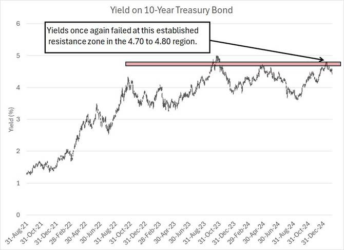
As you can see, the 10-year yield peaked at over 4.80% on January 13th, just a few days after BLS released the December Employment report. Today with yields back around 4.42% they’re down about 19 basis points since January 17th, the trading day before Donald Trump was sworn in as President of the United States.
They’re down 27 basis points since January 8th, the trading day before the hot December jobs report from BLS, down 15 basis points year-to-date and up less than 5 basis points since December 17th, the day before the FOMC’s December 18th announcement widely seen as hawkish on rates.
Frankly, if I were stranded on a desert island for the past few weeks and someone handed me a pile of newspaper headlines and a summary of the economic data since January 1st, I’d probably conclude 10-Year Treasury yields “should” be higher.
However, the fact is they’re not.
Think about what the market is telling us.
There are many potential reasons the bond market isn’t performing as the fundamentals and narratives in the news suggest they “should.” I’d highlight three of the biggest.
First, and foremost, financial markets are forward-looking. Last time I checked, the US presidential election was more than three months ago, and President Trump has made no secret of his intent to use tariffs as part of his trade strategy; indeed, he enacted tariffs in his first term, so the market already has a blueprint to follow. The incoming administration has also outlined, both on the campaign trail and in the eleven weeks between the election and inauguration day, many key, planned tax and regulatory policies.
Financial markets are the world’s greatest “artificial” intelligence model. They represent the collective wisdom of tens or hundreds of millions of investors all analyzing vast troves of incoming data on the economy, various commodity markets, read-through from corporate earnings releases and combing the charts for clues and trends. Some, even many, may well be naïve, however there are undoubtedly some very savvy investors putting real money to work in equity, fixed income and commodity markets they know very well.
My point is that markets aren’t going to wait for Donald Trump to be sworn in, or for the Trump Administration to announce tariffs or other measures, to react to the implications of those changes.
I can guarantee you that even before Americans went to the polls on November 5th there were already plenty of investors busy creating playbooks for how to react to likely policy changes.
And while (theoretically) no one has early access to key government economic releases like the monthly payrolls reports from BLS, there are plenty of other higher frequency datapoints we can monitor:

Source: Federal Reserve Bank of St. Louis FRED Database
This chart shows weekly initial jobless claims – first-time filings for unemployment reported by the individual US states – as a blue line and the four-week moving average of claims as an orange line.
I like to watch that 4-week moving average because it helps filter out some of the week-to-week “noise” in the data.
I’ve labeled the week of November 2, 2024, the Saturday just ahead of the election. As you can see, unemployment claims generally declined from early November through the end of the year, a signal that perhaps the US labor market was strengthening.
So, while the December employment report released by BLS on January 10th may well have been stronger than the consensus had expected, it was by no means a total shocker – we had plenty of evidence to suggest that the US labor market was strong and generally improving since the summer of 2024.
When I first started watching economic data releases in the mid-1990s, there was still a good deal of drama and uncertainty on Fed announcement days – at graduate school I was even known to place wagers on expected Fed decisions.
However, that hasn’t been the case for some time now. The Powell Fed has become somewhat (in)famous for communicating to markets well ahead of time what it intends to do. And in recent years when markets were betting the “wrong” way, the Fed is thought to have leaked articles to outlets like the Wall Street Journal to correct those misperceptions ahead of scheduled meetings.
So, I’m not sure the Fed’s “hawkish cut” on December 18th was as much of a surprise as some in the financial media have portrayed.
My point is simple – markets price in expected economic data, political developments and news well ahead of the actual event.
So, the fact yields have fallen this year despite a still-hot employment picture, the threat of tariffs and the Fed’s hawkish policy mutterings suggest all that information was already priced into the bond market at the beginning of the year.
It’s the same situation when a company reports better than expected earnings and then sells off the next trading day – when markets were already expecting a strong earnings release, they buy the rumor and sell the news.
And that brings me to this:
The Anchoring Bias
Second, perhaps the market doesn’t believe the prevailing narratives in the mainstream media.
It’s not universally true, but many (perhaps most) of the bearish calls I’ve heard regarding fixed income in recent weeks, both in the mainstream media and even Wall Street research, rely heavily on political arguments regarding expected policy changes from the Trump Administration.
At the press conference Q&A session following the central bank’s December 18th policy decision, the word tariff was mentioned 8 times, the Trump Administration was mentioned twice, and potential changes in fiscal policy were mentioned 3 times all in a session lasting about 40 minutes. The media is pretty fixated on politics.
Psychologists call it an “anchoring bias.” That refers to humans’ natural tendency to fixate on one specific datapoint or issue when making decisions even when there are other pieces of information that are more important.
Politics, especially national politics, are emotional and most people have a strong opinion on key issues.
The media learned long ago that emotions attract attention, sell subscriptions and, by extension, please advertisers. So, the media, even the business and financial media, tend to put a great deal of weight on political arguments and narratives.
Over the years I’ve been on financial television plenty of times and I can’t recall more than one or two examples of an interview lasting longer than 3 minutes where I was NOT asked about some political issue and the implications for markets.
In my view, this leads to an anchoring bias on political narratives and a popular consensus on certain economic and market-related topics in the mainstream media based on political arguments.
However, markets don’t necessarily suffer from the same anchoring bias as media personalities and individual investors. That’s why, for example, renewable energy stocks outperformed traditional oil and gas stocks through Donald Trump’s first term. The same renewable energy stocks then underperformed traditional energy by a record margin through Joe Biden’s four-year term.
There’s a lot more to markets than who sits in the Oval Office.
In this case, it seems markets are telling is that either expected policy moves from the Trump Administration won’t be as inflationary as some have predicted or that other factors, like a potential softening in economic growth this year, are more important. Simply put, for whatever reason, the markets aren’t buying in to the popular bearish political narrative for bonds.
And that brings me to my third point.
As I explained a bit earlier on in this update, prevailing sentiment on bonds in December and early this year was very negative. Fund managers appear to have been underweight bonds to the greatest extent in more than two years, expecting higher inflation and stronger economic growth.
So, my point is that everyone was already positioned for higher yields, and lower bond prices, earlier this year, which led to two issues:
For yields to rise further, you’d need to see more active funds, already (very) underweight fixed income, move to an even larger underweight.
On any whiff of positive news for bonds, such as the better-than-expected CPI and PPI numbers in mid-January, yields can see an outsized move lower as underweight funds seek to reduce their underweight stance in fixed income.
I’m not sure which of these factors is behind the recent decline in yields or, more likely, it’s some combination of all three.
However, one of the most amazing features about financial markets is how fundamental and sentiment factors often line-up with the technicals (the charts).
In this case, it appears market participants reached an extreme bearish positioning in bonds and the fundamentals looked weakest just as yields reached the top of their trading range. An effort to break higher in yields for a much-talked-about retest of 5% on the 10-year Treasury failed, and yields took a quick move lower since mid-January.
In my view, the fact that yields couldn’t break out of their range even after the hot jobs number and the initial wave of tariff news from the Trump Administration, suggests we’re more likely to see a move back to the bottom of the range, perhaps to 4% or lower in coming weeks, rather than new highs over 5%.
After all, even after the recent decline in yields, we remain closer to the top of the trading range in place since 2023 than the bottom. That implies a tailwind for bond prices (lower yields).
So, the question is how to benefit from that shift:
Value in Duration
As I outlined earlier, I’m often asked which bond, credit and preferred ETFs I recommend in the Smart Bonds model portfolios offer the best values at the current price.
The value I see is in duration.
The sharp rise in rates late last year and into mid-January acted as a headwind for ETFs with significant duration (interest rate) risk. And while these ETFs are, by and large, off their mid-January lows there’s considerable additional upside – and cumulative monthly income from distributions – should yields drift back towards the bottom of their trading range or even just march in place going forward.
We have a decent blueprint for what works in environments like this from last year:

This chart shows the performance of one of the two preferred stock ETFs we recommend in the model portfolio (see below) as a blue line. I’ve adjusted this line to reflect the monthly distributions paid by this ETF (the current annual yield is around 6.4%).
The orange line shows the performance of this ETF relative to AGG, the aggregate bond ETF I highlighted earlier on in this issue – a rising orange line suggests the preferred ETF outperforming the broader bond market and vice-versa.
I’ve also shaded the chart in red and green. The red regions indicate periods when the yield on the 10-Year Treasury bond was generally rising towards the top of the aforementioned trading range – this includes the period from the beginning of my chart in March 2024 through to the end of April as well as the period from mid-September 2024 up until mid-January 2025. These periods of rising yields generally represent a tough environment for duration. Fixed income and fixed rate preferred stocks such as those in this preferred stock ETF – about 79.2% of the portfolio is in fixed rate preferreds and 16.2% in fixed to floating rate preferreds – will tend to experience headwinds when rates are rising.
On the other side of the coin, the green-shaded areas represent periods when yields were generally falling – basically that’s early May 2024 through mid-September and the period since mid-January 2025.
What you can see is that this preferred stock ETF both performed well in absolute terms and beat AGG through the period of falling yields from May to September 2024 and fell, underperforming AGG, from mid-September 2024 through mid-January 2025.
I see this fixed rate preferred ETF as a good example of the sort of rate-sensitive holding that’s been hit, particularly on a relative basis, amid the recent period of rising rates and should see an outsized benefit as rates now move back to the low end of their trading range.
I would caution that this does NOT mean you should ignore some of the recommended ETFs in the portfolio with floating rate exposure:
Performance Through the Cycles
Duration and rate risk are far from the only factors to watch when it comes to bond, credit and preferred stock ETFs.
Some of the ETFs in the model portfolio may not enjoy a huge tailwind from falling rates but have a record of performing well through both rising and falling rate regimes we’ve seen over the past year.
Take a look:

This chart shows our favorite Senior Loan ETF – a fund that invests in floating rate bank loans – over the same period and on the same basis as our chart of the preferred stock ETF above.
Floating rate loans carry rates that reset periodically based on interest rate benchmarks like the Secured Overnight Financing Rate (SOFR), 3-month Treasury Bills or the Prime Rate. So, when rates rise, the rates charged on these loans re-sets higher – as a result, loans can actually benefit from rising rates and protect investors against the duration risk that’s common to fixed income securities like traditional bonds.
As you can see, this ETF has performed well in absolute terms over the entire period covered by my chart – it’s up 7.8% since March 1, 2024 compared to 3.8% for AGG.
Granted, this ETF did underperform AGG during a period of falling yields from April through mid-September 2024; however, the fund still produced a positive absolute return even as rates were falling and quickly bounced back on a relative basis as yields stabilized in mid-September.
Simply put, it’s hard to call this floating rate loan ETF a “value” trading near all-time highs.
However, with a yield over 8% and a track record of performing well in flat-to-rising rate environments while holding its own during periods of falling yields, I’m not going to recommend selling this ETF simply because yields may continue to fall back over the next few months.
With these points in mind, I’m not recommending any new additions or changes to the model portfolio this week. However, your next quarterly deep-dive issue of Smart Bonds will be out in late-February or early March and I’m eyeing some potential new additions and adjustments leading up to that issue – stay tuned for flash alerts and updates.
For now, here’s a look at the Smart Bonds model portfolios:
Keep reading with a 7-day free trial
Subscribe to Smart Bonds to keep reading this post and get 7 days of free access to the full post archives.