

Editor’s Note: In my last issue released on Friday, I included a link to take a free 90-day trial membership to the paid tier of Smart Bonds and a reader pointed out to me that the link was for an expired offer.
My apologies — my only excuse is that late last week was a wild one for global markets as many of you are undoubtedly aware. I corrected the problem and the free trial offer is good through April 16th for those interested:
— EG
There are two flavors of economic data.
Soft economic data is based on more subjective surveys and includes series such as the Institute for Supply Management’s (ISM) Purchasing Managers’ Index (PMI) for Manufacturing as well as various consumer confidence surveys.
Then there’s the hard data, which seeks to assess and quantify economic activity on a more tangible basis – the monthly Employment Situation Report from the US Bureau of Labor Statistics (BLS) is a classic example.
The advantage of soft data is that it’s leading. When the economy weakens, you’re likely to see the first signs of ill wind from the soft data, often months or even a few quarters before it shows up in data like the monthly payrolls releases from BLS.
The disadvantage of the soft data is that it’s noisier and prone to false positives for those trying to assess the probability of recession.
Today, we’re seeing clear signs of a weakening in the soft data; however, the hard data remains healthy.
That’s the same set-up we encountered back in 2022:
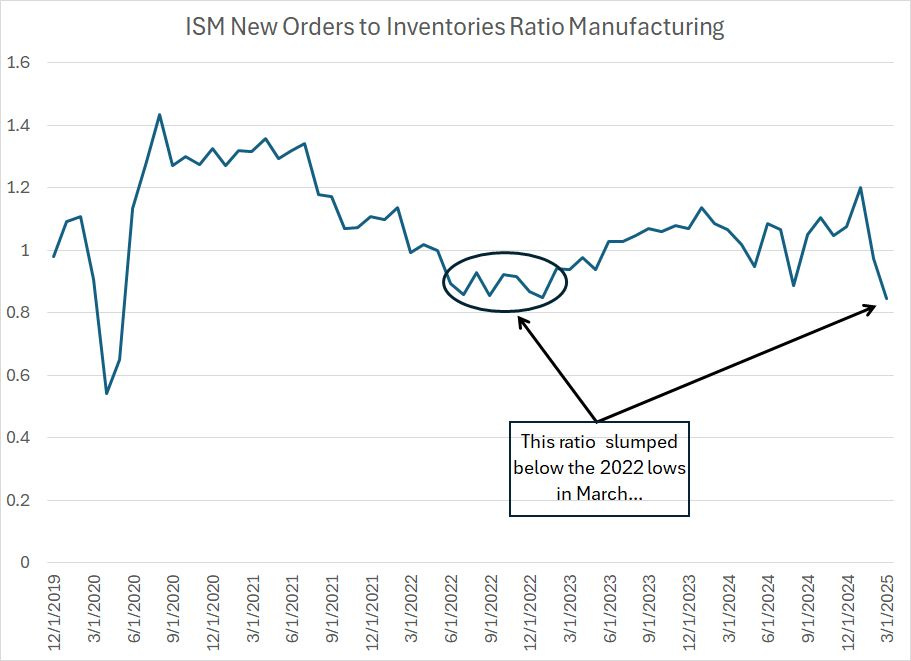
Here’s a ratio I follow based on the monthly ISM Manufacturing Report on Business.
It’s the ratio of the ISM New Orders Index to the ISM Inventories Index.
New Orders is based on a survey of managers at US manufacturing companies regarding the incoming pace of new orders for products. As with all ISM indices, readings above 50 suggest an accelerating pace of new orders while readings under 50 indicate contraction.
Meanwhile, the ISM Inventories ratio tracks whether manufacturers are building inventories or burning through inventories.
What’s pictured on my chart is the ratio of these two indices – readings above 1.0 tell us the New Orders index is higher than inventories. That’s generally a sign of strength for the US economy because it means that manufacturers are seeing a stronger pace of incoming new orders coupled with lean or declining inventories.
Readings well under 1.0 are a sign of trouble ahead. This set-up suggests new orders are contracting (or weakening) while inventories are building, leading to the risk that manufacturers will be stuck with a growing pile of unsold goods.
This chart covers the period from December 2019 to the present. As you can see, the ratio collapsed well below 1.0 in early 2020 and then recovered quickly to above 1.4 later that year. This reflected the “sudden stop” for the US economy amid COVID lockdowns in 2020 followed by massive fiscal stimulus, which drove a surge in manufacturing activity.
In the summer of 2022 this ratio also weakened below 1.0 – to around 0.85 – and remained in that range for several months before recovering into early 2023.
This was a sign of weakness for the US economy, and it summarizes neatly why there was significant talk of a recession in late 2022. Indeed, in my view, there was elevated risk of recession at that time.
The 2022 signal proved false, and the Federal Reserve stuck a (rare) soft landing despite the most aggressive tightening campaign in a generation. We never saw the “hand-off” of economic softness from the soft survey data to the hard data like payrolls.
I believe part of the reason is that while the Fed was tightening monetary policy, the fiscal policy throttle –government spending and employment – was wide open. That’s a topic I’ve covered before here in Smart Bonds.
Regardless, despite all the warning signs from the soft data, we didn’t get a recession and that’s resulted in a growing tide of complacency in markets.
Investors, and policymakers, have been too quick to dismiss weakness in soft data and leading economic indicators lately because of the 2022 experience. Indeed, as I highlighted in Friday’s issue of Smart Bonds, during the press conference that followed the central bank’s March 19th meeting, Fed Chairman Jerome Powell noted “the relationship between survey data and actual economic activity hasn’t been very tight.”
That’s a mistake for two reasons.
First, there’s no such thing as an infallible economic indicator. However, in most cycles, a deterioration in the soft data is followed by weakness in the hard data and, ultimately, a recession or severe economic slowdown that impacts markets. The fact that this hand-off didn’t happen in 2022 doesn’t negate the experience of the entire post-war era.
Second, by the time we see real deterioration in series like payrolls, the die will be cast, and the Fed will be behind the proverbial curve.
And the softness in the ISM ratio I just outlined is undeniable. Indeed, in March, this ratio slumped below the 2022 nadir. And the ISM Manufacturing Index is released on the first trading day of each month, based on a survey collected in the prior month; the March ISM data released on Tuesday April 1st was collected long before the Trump Administration released details on tariffs and long before the stock market had slumped 9%+ over two days.
Let’s turn from the real economy to the financial economy with this:
Credit Spreads
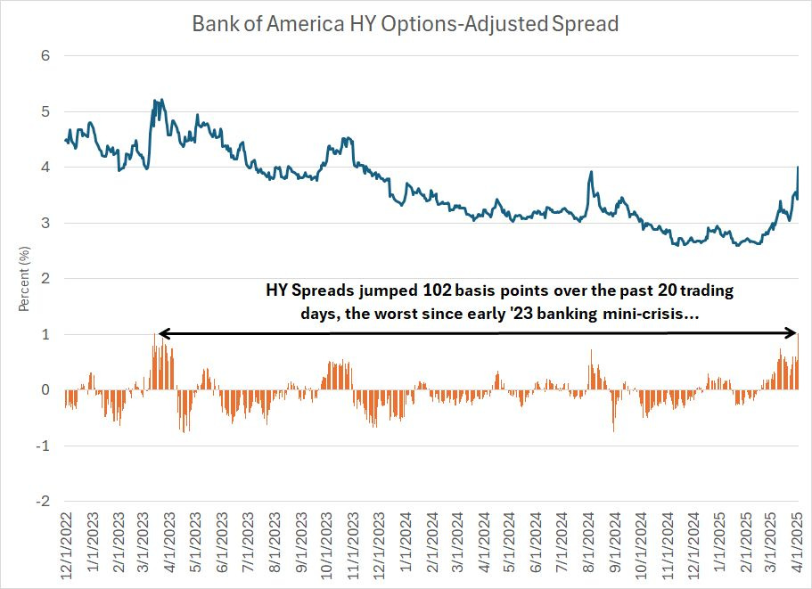
I wrote about high yield credit spreads in he March 14, 2025 issue of Smart Bonds titled “The Economy, Credit Spreads and Global Rotation.”
At that time – less than one month ago – the spread between the yield on high-yield (junk) bonds and US Treasuries of similar duration was well-behaved, a signal markets weren’t too worried about the health of the economy.
That’s changing:
Source: Federal Reserve Bank of St. Louis FRED database
This chart shows the spread between the yield on the Bank of America High Yield Bond Index and Treasuries since early December 2022. The orange columns below the chart show the 20-day change where a positive number indicates a rising high yield credit spread.
As you can see, on an absolute basis, spreads are now around 4%, which isn’t high based on long-term historical norms, but it’s the highest this cycle since late 2023. What’s more important in my view is the speed of the shift – over the past 20 trading days (roughly a month), high-yield spreads have ballooned 102 basis points (1.02%), which is the fastest rise since the regional banking mini-crisis in early 2023.
Let’s take a look at how this spread tends to behave through historical economic cycles, starting with this:
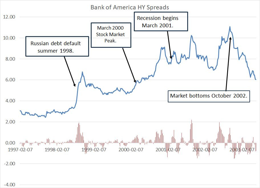
Source: Federal Reserve Bank of St. Louis FRED Database
This is the same high yield spread index except I’ve plotted it on a weekly basis from early 1997 through early 2003. The orange columns represent the four-week change in spreads and I’ve also labeled some key events that happened over this period including the Russian debt default in the summer of 1998, the stock market peak in March 2000, and the start of the (mild) recession of this era in March 2001.
Notice how high-yield spreads spiked in the summer of 1998. The Fed helped quell that panic with 3 rate cuts late that year and high-yield spreads relaxed, but did not fall back to their 1997 levels.
High yield spreads spiked again in early 2000, just ahead of, and through, the peak in the stock market in March of that year. While there was some stabilization through the summer of 2000, this index generally drifted higher for a few months and then spiked again into early 2001, just ahead of the start of recession.
Now, let’s look at the period from 2005 through 2009:
Source: Federal Reserve Bank of St. Louis FRED Database
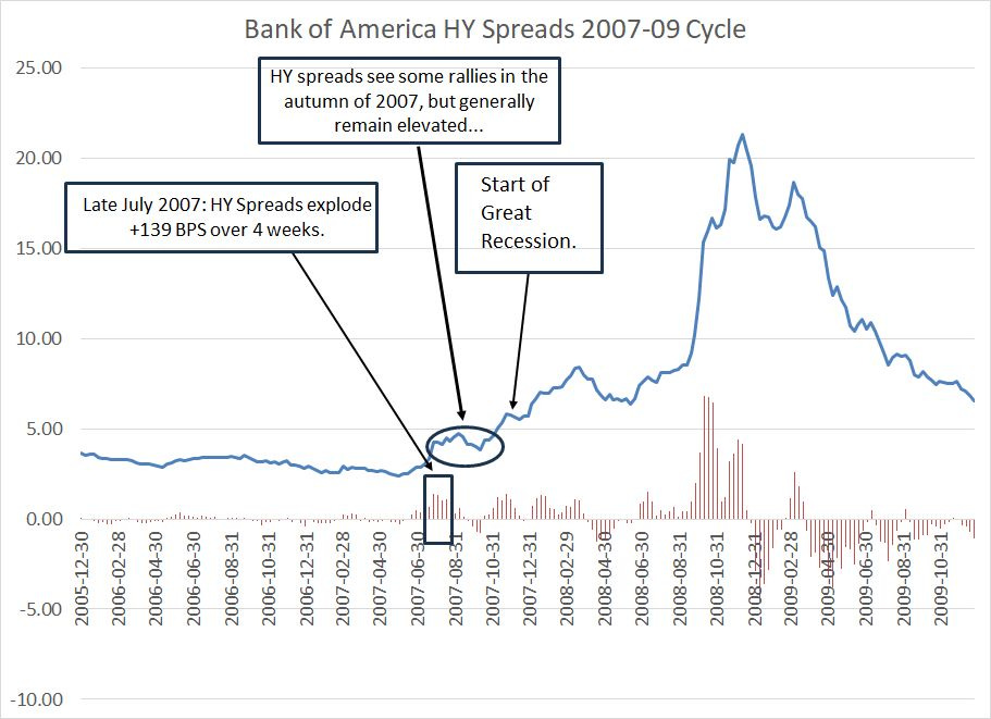
This chart includes the lead-up to the Great Recession and financial crisis of 2007-09, the entire bear market and the first few months of the next upcycle.
The 2007-09 Great Recession was far more severe than the 2001 downturn and, even more important, it had a far more profound and enduring impact on credit markets, which is what we’re evaluating when we look at high yield spreads.
In this cycle, we saw an initial spike in spreads starting in the summer of 2007, followed by a period of stabilization and then a renewed spike into early 2008. The Great Recession started in December 2007, and the stock market peaked about two months before that in October.
Finally, we saw a second period of stabilization in spreads into the summer of ’08 followed by a mega-spike late that year following the bankruptcy of Lehman Brothers and the near collapse of multiple other financial institutions.
It’s important to understand spikes in credit spreads don’t always lead to recession:
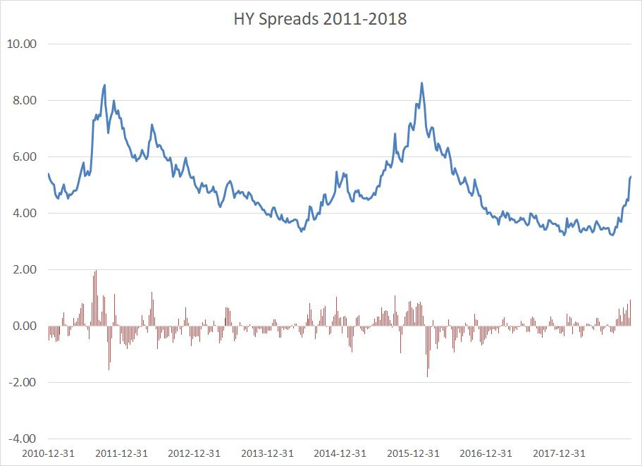
This chart shows high yield spreads on the same basis from yearend 2010 through 2018. There are three prominent spikes in spreads evident in this chart – the first in 2010, followed by 2014-15 and late 2018. None ended in recession though, the stock market did see significant corrections in all these cycles and the US economy showed signs of slowing.
Here's the situation on a weekly basis today:
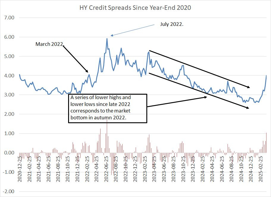
Source: Federal Reserve Bank of St. Louis
As you can see, credit spreads began to rise in late 2021 and then peaked in mid-2022 near 6%. The series of lower highs and lower lows since late 2022 is consistent with the bull market in the S&P 500 and receding risk of recession.
Of course, that pattern is now broken – the recent surge in high yield spreads on this basis is highest and most prolonged since the 2022 cycle. That’s consistent with rising recession risks right now, particularly when you consider the ongoing deterioration in the soft economic data I just outlined.
Let me be blunt:
I believe the risk of a US recession over the next 12 months is now around 50%.
Calling recessions is an exercise fraught with peril, because recessions are rare – since February 1945, the US economy has only been in recession for 132 months, about 13.7% of the time. However, enough items on my bear market and recession checklist have been ticked to warrant caution.
The good news, if you can call it that, is that economic downturns and recessions are generally positive for the fixed income (bond) market, particularly investment grade corporate and government bonds, which are viewed as a safe haven.
In Smart Bonds, we’ve been adjusting to these rising risks for some time now; it’s important to give a brief review of where we’ve been to understand where we’re going.
Last July, in “The Great Duration Tipping Point,” I outlined a high-level blueprint for how I plan to manage the model portfolios in this service through the economic and market cycle. Specifically, I outlined a plan for adding duration – positive leverage to falling rates – when the economy shows signs of softening, and then getting more aggressive as recession appears imminent.
Last July, while I concluded it was too early to add duration, I explained how various classes of bonds, credit and preferred stock ETFs trade through the cycle.
About a month later, in late August 2024, I added a small position to an intermediate-term Treasury and an intermediate-term investment grade corporate ETF to the model portfolios while reducing our exposure to the Collateralized Loan Obligation (CLO) market that’s vulnerable when the economy weakens.
While that move proved a bit early, it’s now looking like a solid adjustment.
This year, in the February 6, 2025 issue “Duration, Value and Relative Strength,” I wrote about how I saw limited upside for government bond yields -- the 10-year yield was at near 4.5% at that time compared to less than 4% today – and saw value in longer-duration bond ETFs.
On March 4th, in “Economic Jitters, Adding Duration,” I recommended adding to our exposure in long-duration US Treasuries as well as intermediate term Treasuries and investment grade corporates. On March 14th, in “The Economy, Credit Spreads and Global Rotation,” I recommended adding to our exposure to the international bond market that benefits from both lower rates and a weaker dollar.
And, finally, on Friday April 4th – just last week – I added to our inflation-protected securities allocation.
As a result, both the Baseline and Defensive model portfolio allocations are higher year-to-date, and continue to offer average yields around 5%, despite the epic volatility we’re seeing in the stock market right now.
Here are the most vulnerable segments of the model portfolios in the event of recession and how I plan to handle them going forward:
First, high-yield bonds -- our exposure to this segment is just under 10% right now. For the US high-yield market, we have focused on the highest-quality high yield bonds –an ETF that owns bonds ranked just under investment grade – so the spike we saw in high yield spreads last week overstates our risks somewhat.
(A spike in credit spreads implies that high yield bonds are underperforming Treasuries).
Indeed, since our original recommendation at the end of May last year, we’re still showing a positive return on our US high yield bond ETF.
Regardless, look at my chart above and you’ll see that high yield spread generally see spikes, followed by periods of stabilization, where “junk” debt rallies. I suspect we’ll see such a rally, and my likely response will be to reduce our high yield exposure on strength and rotate the proceeds to higher-quality corporate and intermediate and longer-term Treasury ETFs.
We also have some exposure to high-yield bonds issued outside the US. These bonds have handily outperformed the US high yield bond market due to a combination of stronger economic trends in international markets right now and the dollar’s recent slide. I still like exposure to international high-yield.
Senior loan ETFs essentially own a portfolio of bank loans that pay a variable rate of interest. We only have one recommendation in the portfolios in this category with a weight of less than 7% and it’s still up from our original recommendation last May.
Regardless, loans are more vulnerable to economic weakness and declining credit quality than most niches we cover in Smart Bonds, so we may recommend paring our exposure to this market in favor of other corners of the bond market in coming weeks.
Finally, preferred stocks tend to underperform Treasury bonds in recessions. We have a Baseline portfolio exposure here of approximately 15% right now and it’s a group I’m watching closely.
We’ve tended to concentrate on more defensive corners of the preferred market and preferreds are far less volatile than the S&P 500. This year, for example, the S&P 500 is down about 13.5% while our two preferred ETF recommendations are off just 1.1% and 4.6% respectively.
Let me leave you with three main points before I dive into a detailed portfolio update.
Our portfolio allocations are already defensive and the three more economy-sensitive groups I’ve outlined represent just around one-third of the model portfolio. Even better, the worst-performing ETF recommendation in those groups is down just 4.6% so far this year compared to the 13.5% collapse in the S&P 500.
We’ve been adding to our duration and high-quality bond exposure since last summer and these are the groups that perform best when the economy weakens, and recession risks rise.
I’m looking for a snap-back rally in the broader stock market, and some of he more vulnerable niches of the bond, credit and preferred markets in coming weeks, and will likely use strength to book gains in our more economy-sensitive recommendations in favor of ETFs that perform best when the economy is weakening.
Here’s a portfolio update, including the recommendations made in Friday’s update:
Keep reading with a 7-day free trial
Subscribe to Smart Bonds to keep reading this post and get 7 days of free access to the full post archives.